By Gerald Young, Senior Management Associate, ICMA
Anyone can throw a baseball. Not just anyone can make one dance.
Watching the World Series, it’s amazing to see how some artists on the mound can make the ball sink, curve, slow down, or spin. That’s pitching. In sharing performance data, some local governments stop at the point of throwing – dumping their data files or graphs online as if that’s sufficient to meet their due diligence. It seems like it’s of just secondary concern if the public doesn’t understand what it all means.
At the ICMA annual conference, staff from Kansas City, Missouri, shared some examples of this.
A session entitled “Your Charts Suck,” showcased ways to move from merely passable graphs and charts to those that would communicate the essential information with less clutter. These before and after images show how an initial cut at the data can be made more user-friendly. More dynamic options might include online links to allow readers to see the underlying detail or a text description of the data’s significance and what’s being done to improve on the government’s performance.
Before:

After:
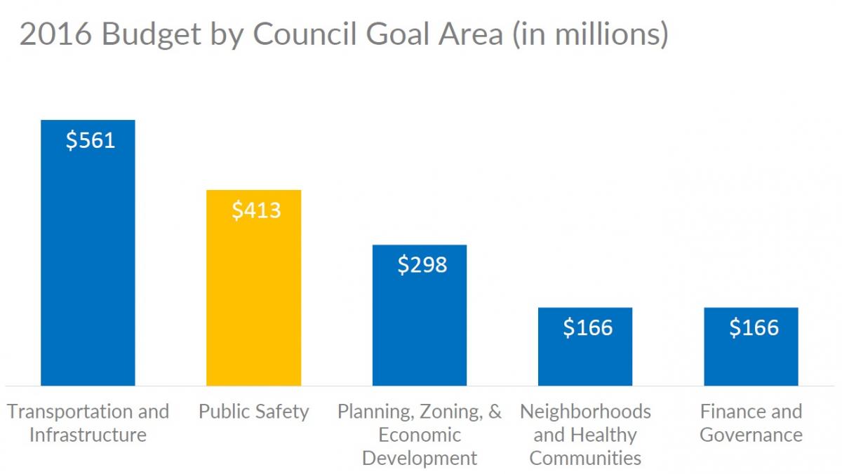
The "before" version includes plenty of color and text, but too much clutter. The "after" version spotlights the key policy issue, simplifies the legend, and overlays key values.
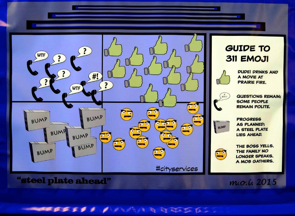
From the "Art of Data" exhibit - rethinking 311/CRM data as a pathway to greater public engagement.
The graphs and charts we share tell the public a story. They can show that we’re cutting-edge and engaged, using all the tools at our disposal to have a constructive dialogue around community issues, or that we’re only willing to share information when it’s in a 3GB file of indecipherable financial spreadsheets that we threw up on the website.
So are you pitching your data to the public or merely throwing it?
Want to Learn More About Performance Management?
Browse the Performance Management topic and add it to your interests.
New, Reduced Membership Dues
A new, reduced dues rate is available for CAOs/ACAOs, along with additional discounts for those in smaller communities, has been implemented. Learn more and be sure to join or renew today!