Reporting performance information to the public can be scary, because whatever data you collect can become grist for public records requests, disgruntled bloggers, public hearing gadflies, or local media—often looking for a scoop about “government inefficiency.”
This is especially true if your performance measurement/management initiative is relatively new. But once your efforts reach maturity, it’s time to put the information in front of the public—often by posting it on the city or county website.
Here are some tips to help put performance data into perspective for the public:
- Share your goals: The purpose of performance measurement is to see how you’re doing, find out what’s working well, and pinpoint areas where you can improve.
- Share your timeline: Clarify that the performance information establishes a baseline for improving both the measurement process itself and the quality of local services.
- Limit what you report: Don’t inundate the public with numbers. Your goal is to increase their understanding. So focus on your key messages and the strategic measures that you want them to remember—such as the length of time it takes to resolve a code violation complaint, or how residents rate solid waste services.
- Explain what you’re measuring and why: The selection of measures to track and report is based on something—the community vision, council goal-setting, feedback from a resident survey, specific complaints about a particular service.
- Include graphics: A chart or map can be worth a thousand words. Don’t skip the narrative, but use visuals to supplement it.
Recipients of Certificates in Performance Management from ICMA provide great examples of effective public reporting. One of the criteria for the certificate is public reporting using graphs, color-coding, dashboards, and other means to highlight performance above/below expectations or varying significantly from past or comparable data.
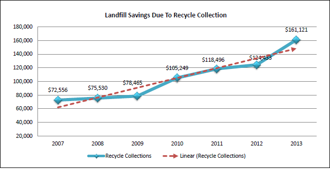
For example, Bloomington, Illinois, published a Solid Waste Analysis on the website that includes this graph to show landfill savings due to collection of recyclables:
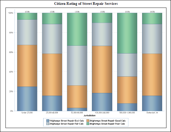
Bettendorf, Iowa, used a color-coded graphic in its performance report to show how citizens rated street repair services: excellent (blue), good (orange), fair (gray), and poor (green). Bettendorf’s ratings are shown in the bar at the right. The graphic also includes comparative data from other jurisdictions in five population ranges:
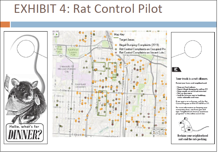
And Kansas City published a public health service report that includes this map showing illegal dumping complaints, rat control complaints on occupied properties, and rat control complaints on vacant lots:
As another example, Tamarac, Florida, publishes a color-coded dashboard to show at a glance how performance compares with established targets.
All of these cities demonstrate how large quantities of performance data can be presented in meaningful ways that demonstrate accountability to the public.
Are you reporting your performance data yet? If not, you may be missing the opportunity to improve your citizen engagement and understanding of local government results.
New, Reduced Membership Dues
A new, reduced dues rate is available for CAOs/ACAOs, along with additional discounts for those in smaller communities, has been implemented. Learn more and be sure to join or renew today!