Key Takeaways from this Post
- Dashboards pull together data to convey real-time knowledge to help you understand the diseases.
- Authorities from global to local use dashboards and maps to display data at different scales.
- The improved pace of data sharing helps speed awareness and preparedness.
As pandemic fears grew in late January, Johns Hopkins University published its now-famous coronavirus dashboard—a map-based tool developed to track and fight the spread of what’s now called COVID-19. Designed by Lauren Gardner and her team from the University’s Center for Systems Science and Engineering, the dashboard went viral almost instantly with hundreds of news articles and shares on social media.
Geography and location analysis play a crucial role in better understanding this evolving epidemic. For a long time now, the healthcare community has used maps to understand the spread of disease, most famously in 1854, when Dr. John Snow connected location and illness with his history-making map of a London cholera outbreak. From disease atlases of the early 20th century to more recent web mapping of Ebola and Zika scares, healthcare professionals have long considered mapping, and more recently geographic information systems (GIS), a critical tool in tracking and combating contagion.
All this said, you’ve probably seen the coronavirus dashboards built by the World Health Organization and Johns Hopkins University. These dashboards intend to educate the public about the spread of the virus and to inform critical actions, like travel bans and quarantine measures. These are indispensable sources of information, but we need to know more to protect our communities best. As local government officials, you have operational duties when it comes to addressing disasters, and you have the responsibility to lead, which means communicating the right information, at the right time, to the entire community.
Help for communities
To support your efforts, Esri has been working with its key partners like ICMA to make readily available the best information products, maps, and dashboards. Visit the coronavirus ArcGIS Hub site that houses the many global, regional, and local applications being built around the world by our trusted partners. We’ve also included relevant data resources that you can use to develop your dashboards and web maps and apps. Esri will continue to update this site with new data and support as it becomes available, allowing you to make essential decisions and communicate with your stakeholders accurately and quickly.
In addition, this letter details all of the ways we are able to support communities including through our Disaster Response Program (DRP) which assists with disasters worldwide. We support response and relief efforts with complimentary GIS technology and technical expertise when your capacity is exceeded. If you would like support, submit a Request for Assistance form and let us know how we can help. Requests are monitored 24/7 and can assist you with GIS software needs, technical support, services, and data.
We’re here to help. Contact HealthInfo@esri.com with questions.
Sample dashboards:
|
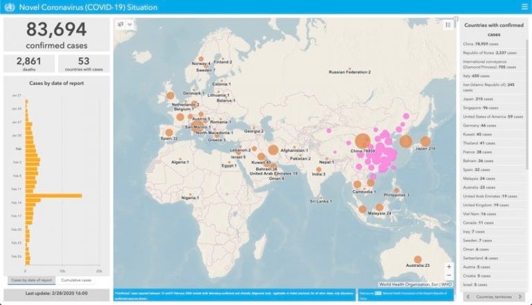
The World Health Organization (WHO) has created a dashboard to track the global spread of COVID-19. |
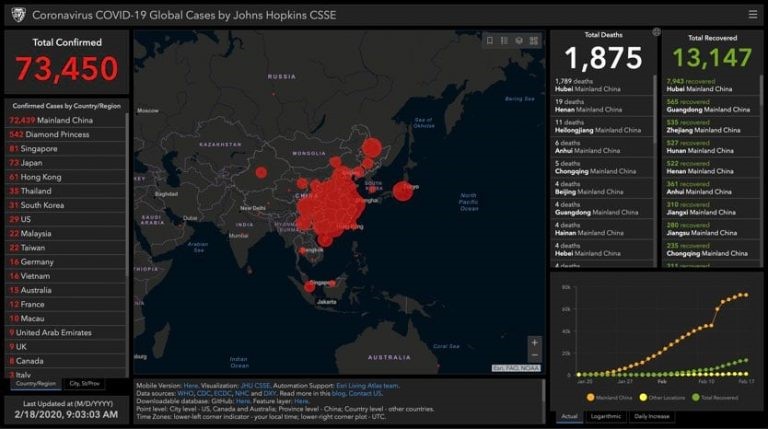 John Hopkins University (JHU) is tracking the spread of COVID-19 in near real time with a map-centric dashboard using ArcGIS Online that pulls relevant data from WHO, U.S. CDC, ECDC China CDC (CCDC), NHC, and Dingxiangyuan. John Hopkins University (JHU) is tracking the spread of COVID-19 in near real time with a map-centric dashboard using ArcGIS Online that pulls relevant data from WHO, U.S. CDC, ECDC China CDC (CCDC), NHC, and Dingxiangyuan. |
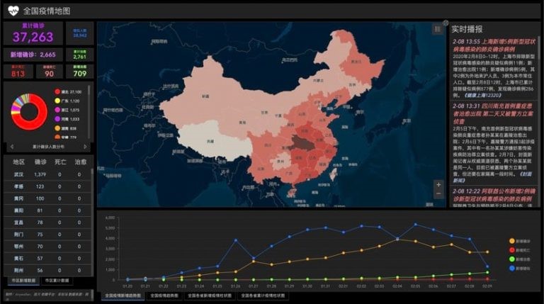
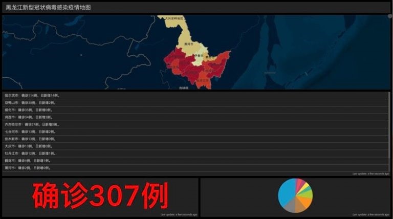 China’s Heilongjiang coronavirus dashboard includes a breakdown of infection status by cities within the province. The inclusion of the number of new cases per city per day allows citizens and experts to observe the disease progression within their immediate vicinity. China’s Heilongjiang coronavirus dashboard includes a breakdown of infection status by cities within the province. The inclusion of the number of new cases per city per day allows citizens and experts to observe the disease progression within their immediate vicinity. |
Several of these tools, like the one created by Johns Hopkins, include a mobile-optimized version, which makes the dashboards more versatile and accessible to the public on phones or tablets. For additional information, visit ICMA’s Coronavirus Resource page. |
Publish with ICMA!
We’re searching for interesting and insightful stories that can help others learn a memorable takeaway to serve their communities better.